Julia Leone is a Graphic Designer and Project Manager from Brooklyn, NY.
Compelling, community-driven, storytelling. See a collection of my work with select non-profits below:
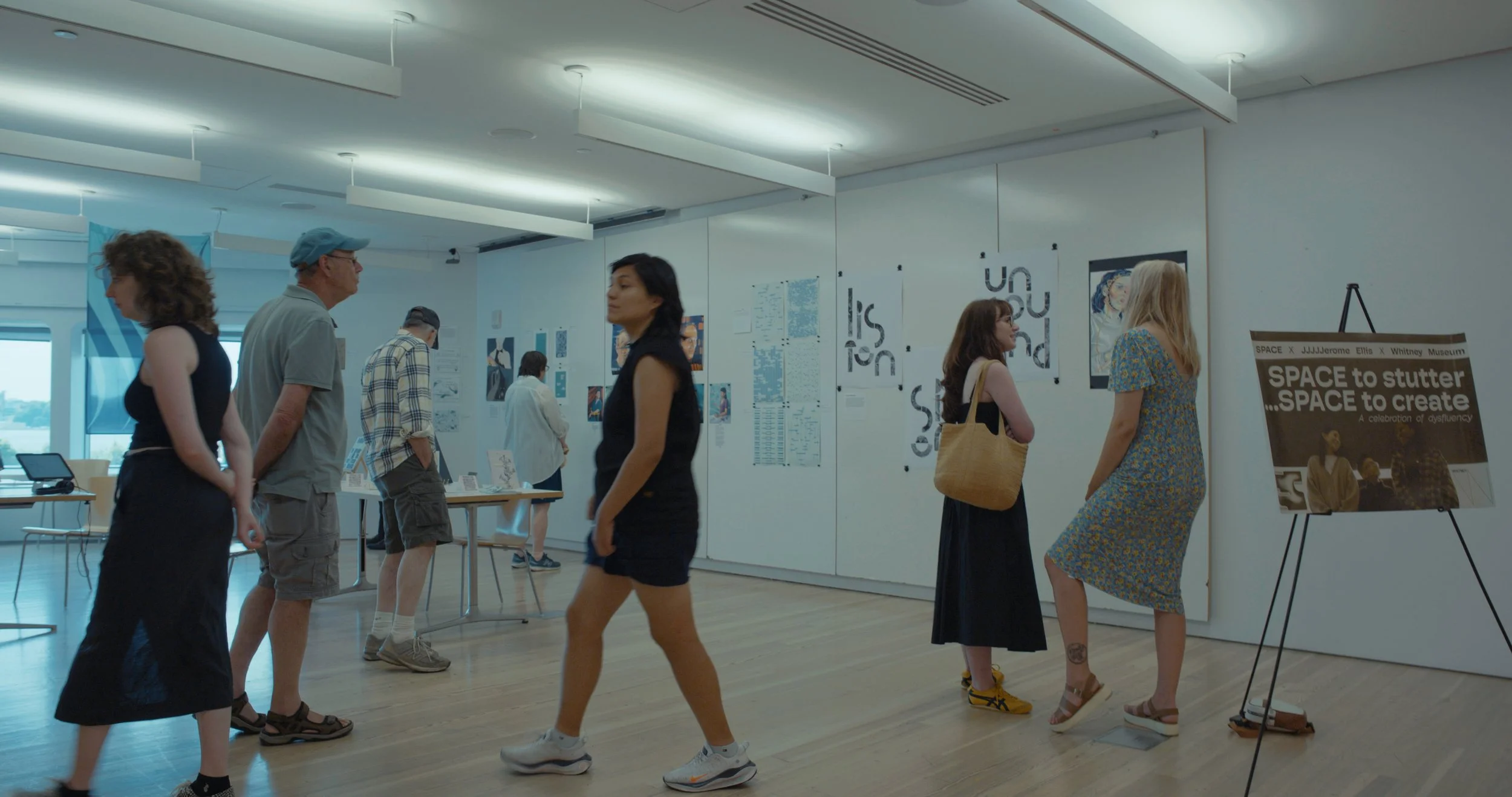
The Whitney Museum x SPACE
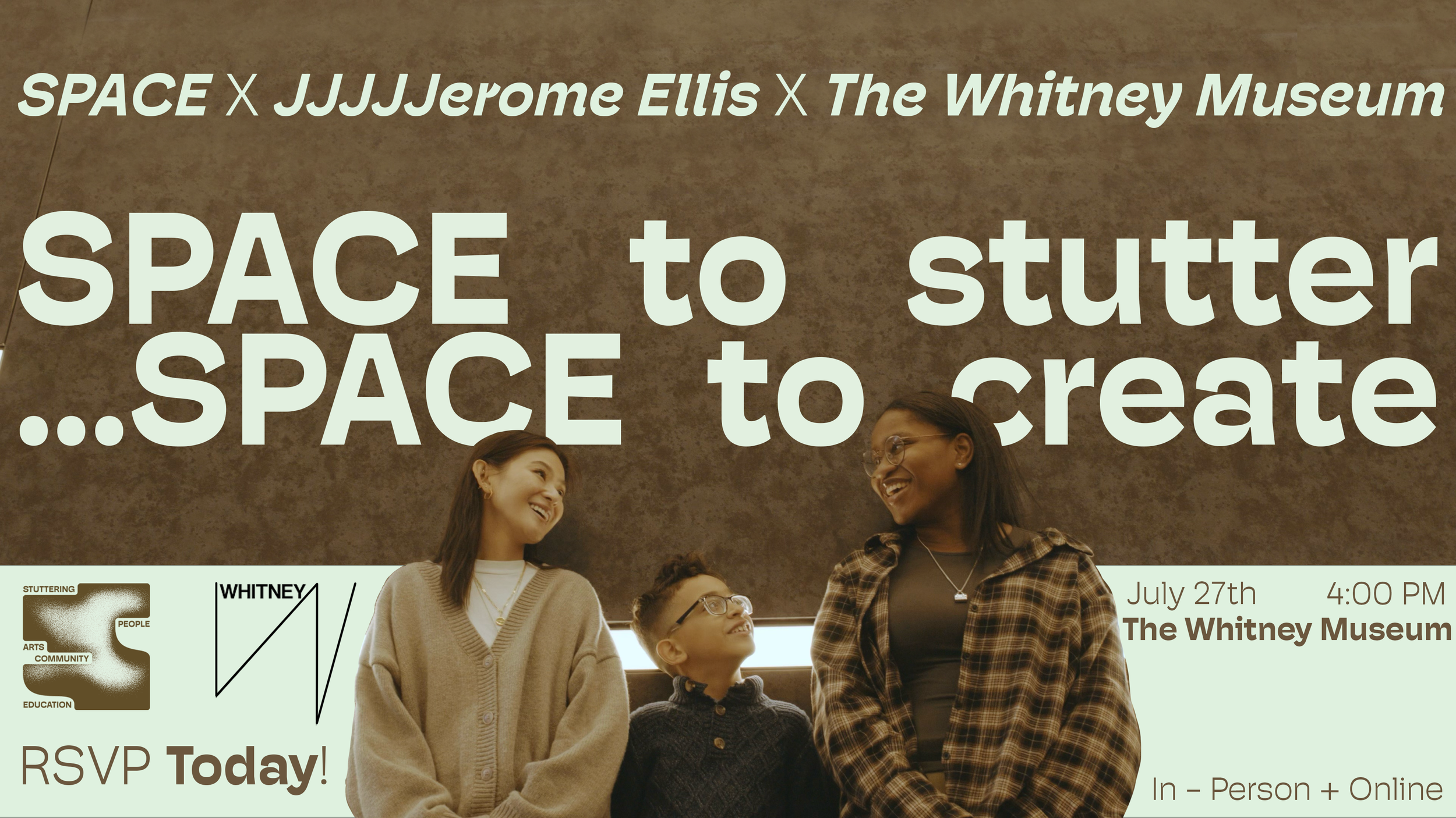
In collaboration with the Whitney Museum, I designed all graphic materials for a one-day performance and installation including flyers, ads, invitations, presentation graphics, artist bios, and more. I also sourced printers to ensure that these materials were made with the highest quality for display. These materials were on display for all attendees of the Whitney and also were showcased at a sold-out event of over 200 people.









The National Stuttering Association
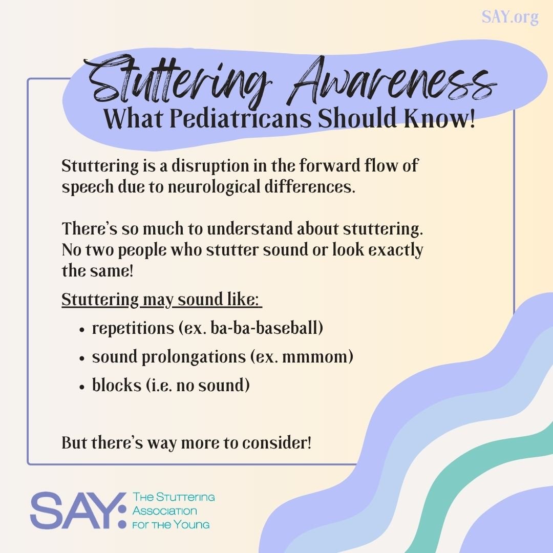
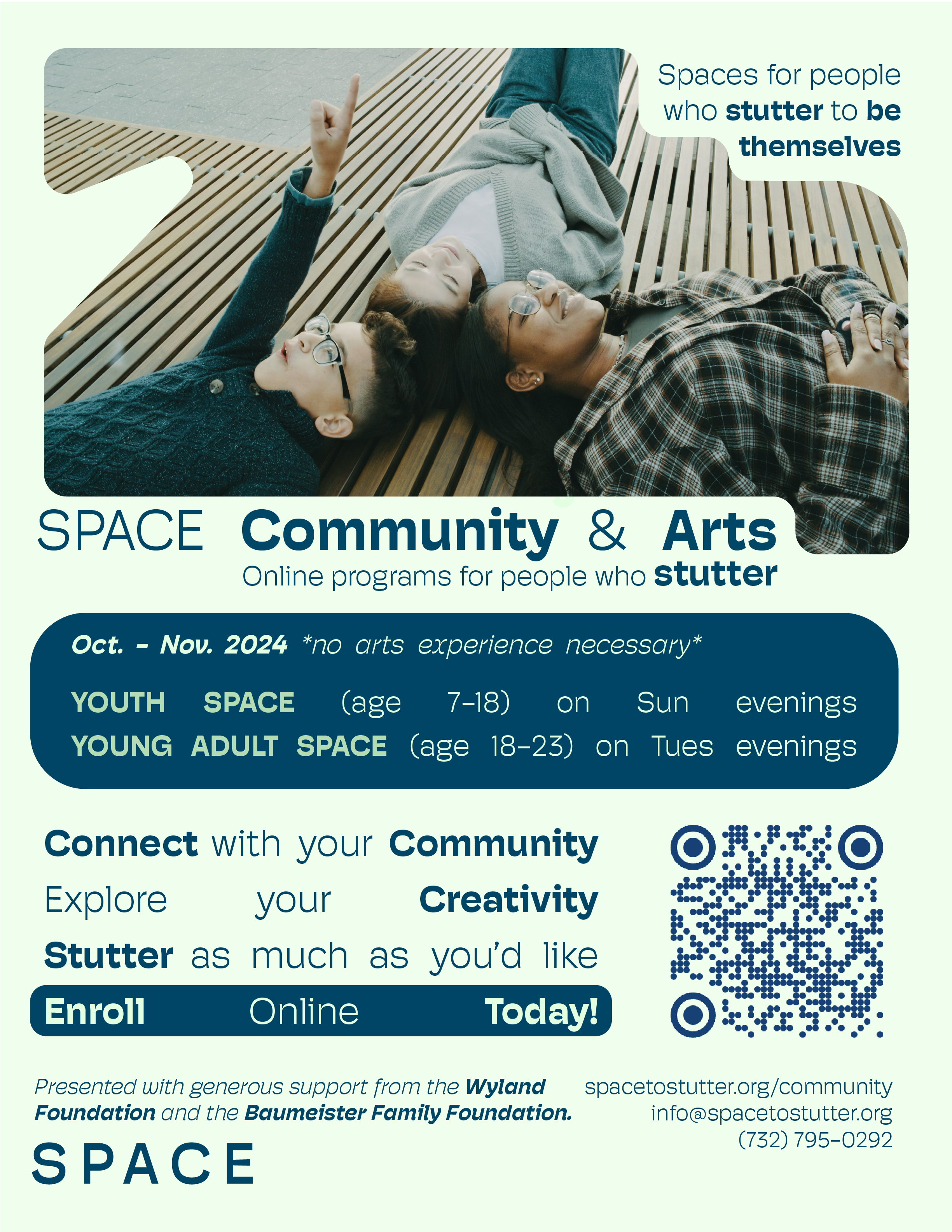
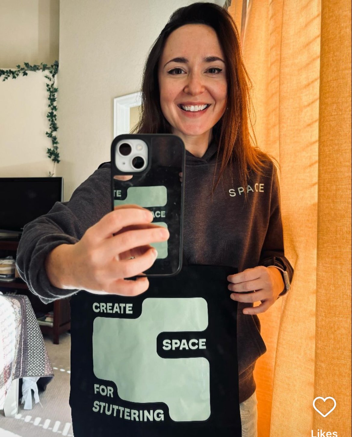
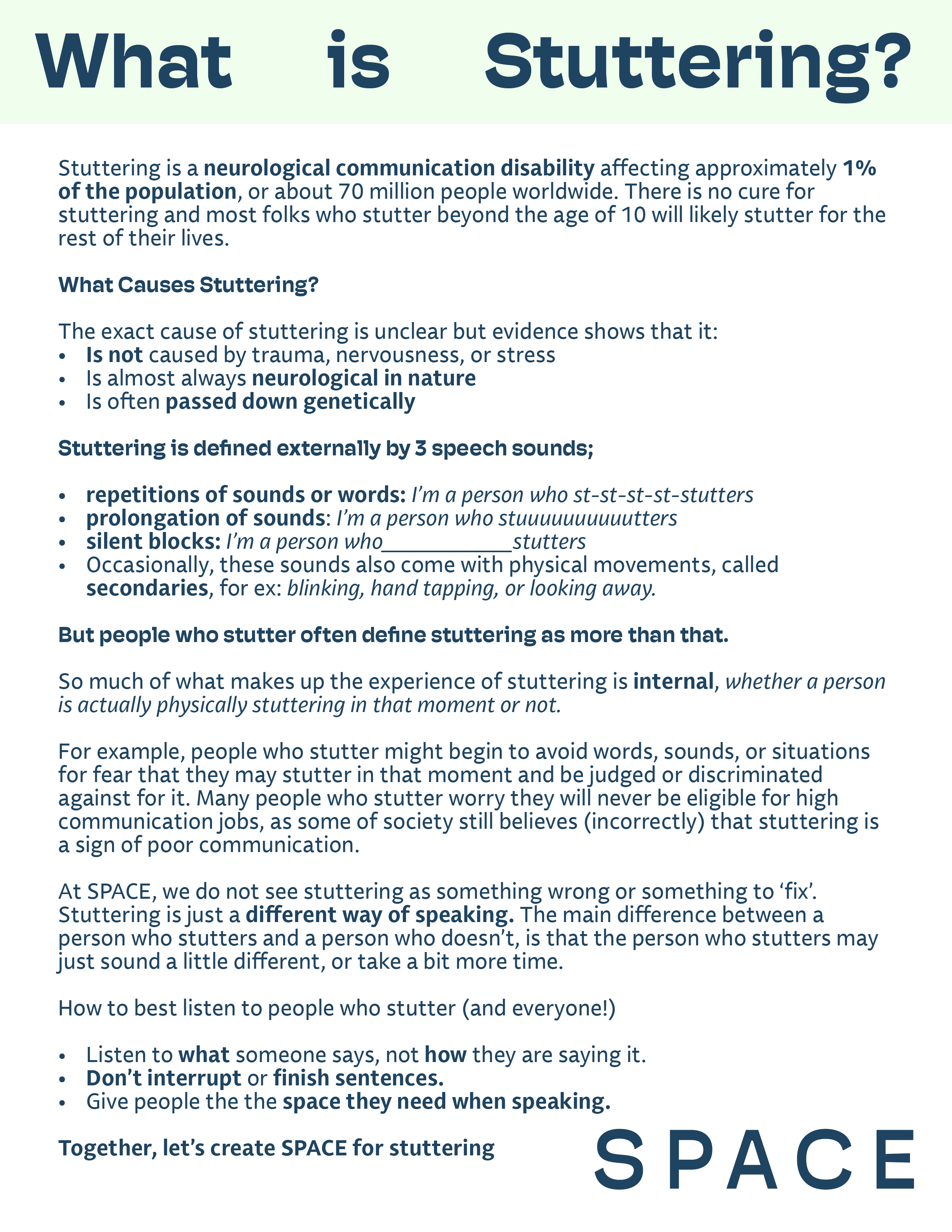
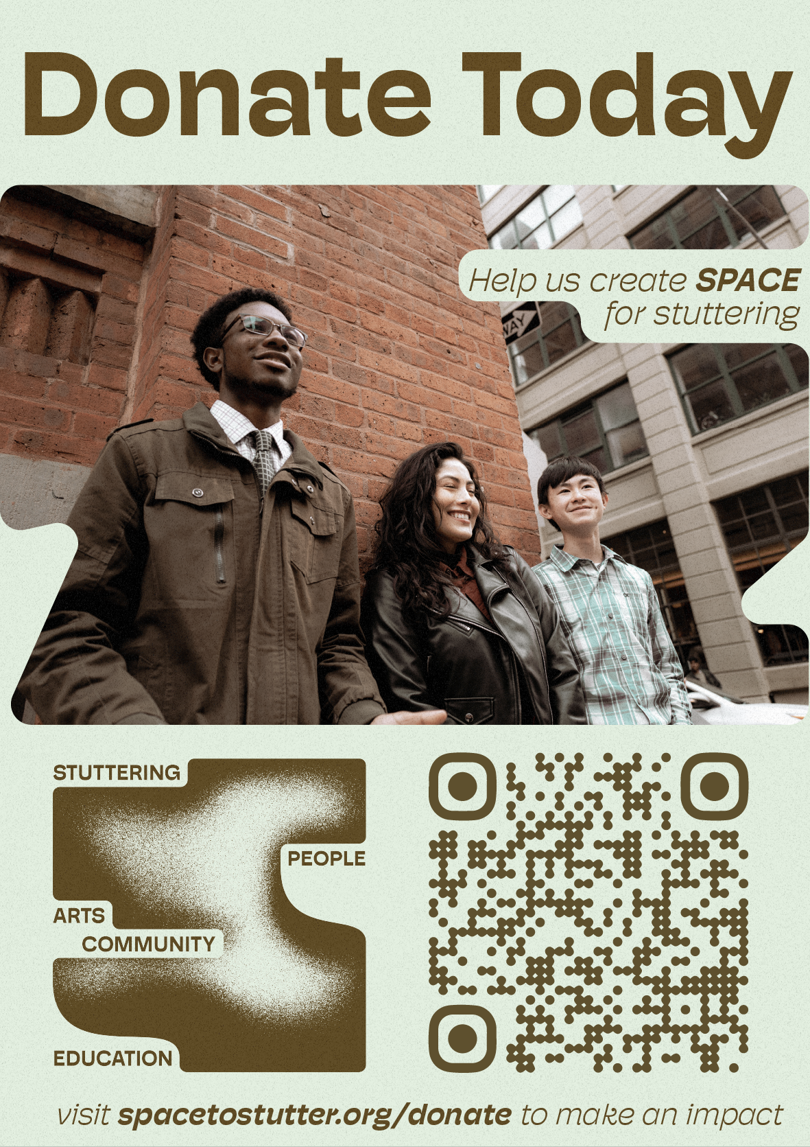
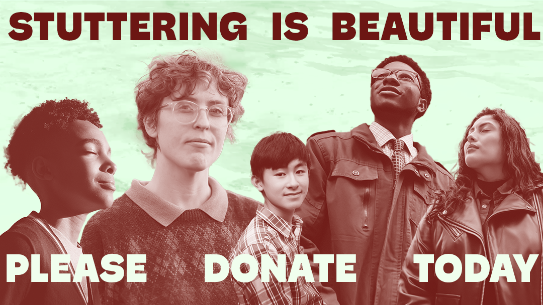
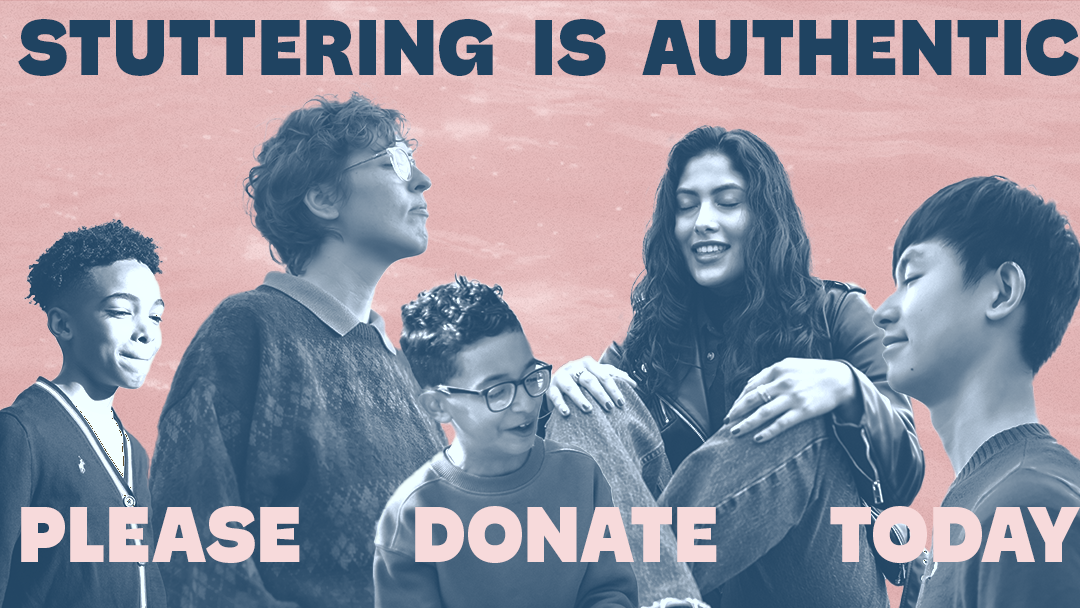
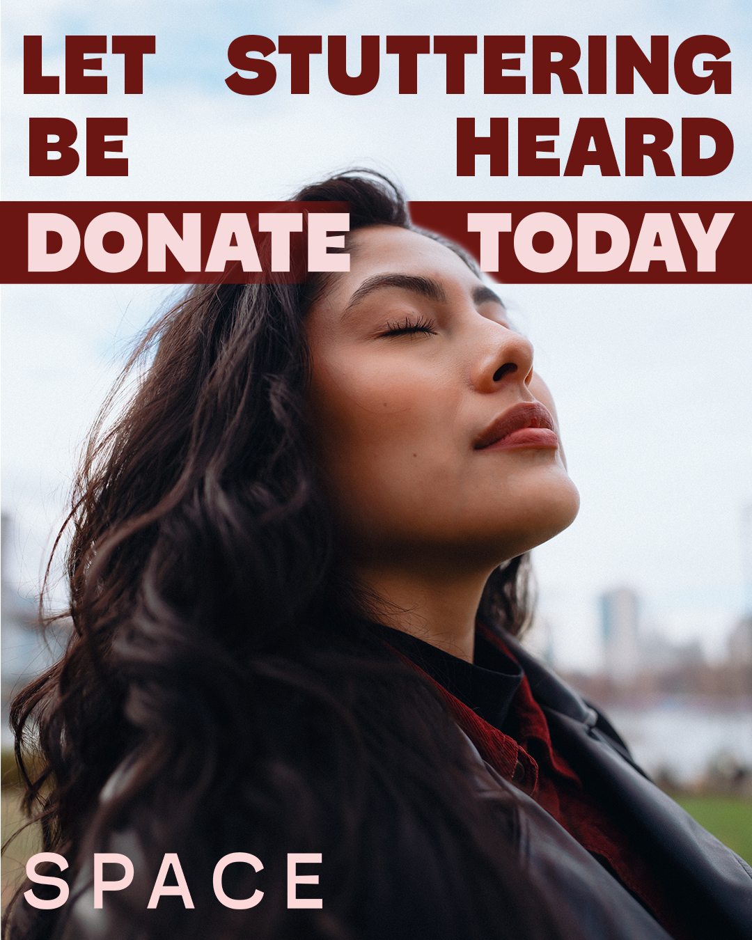
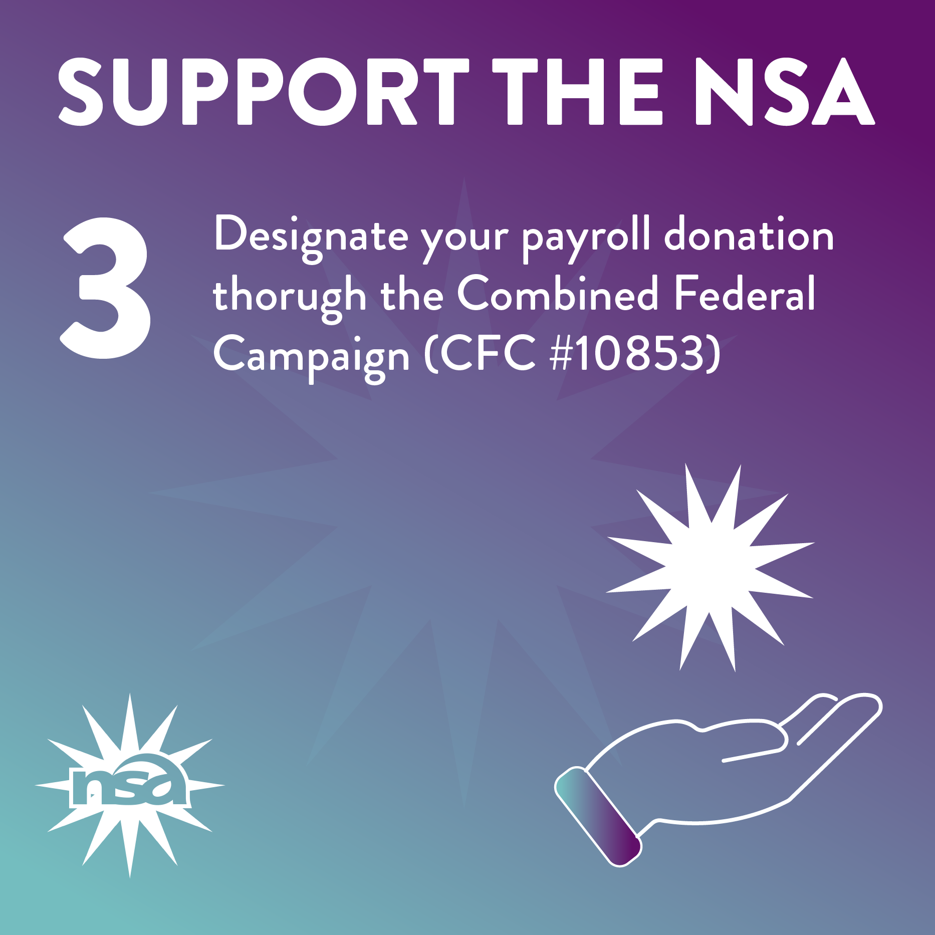
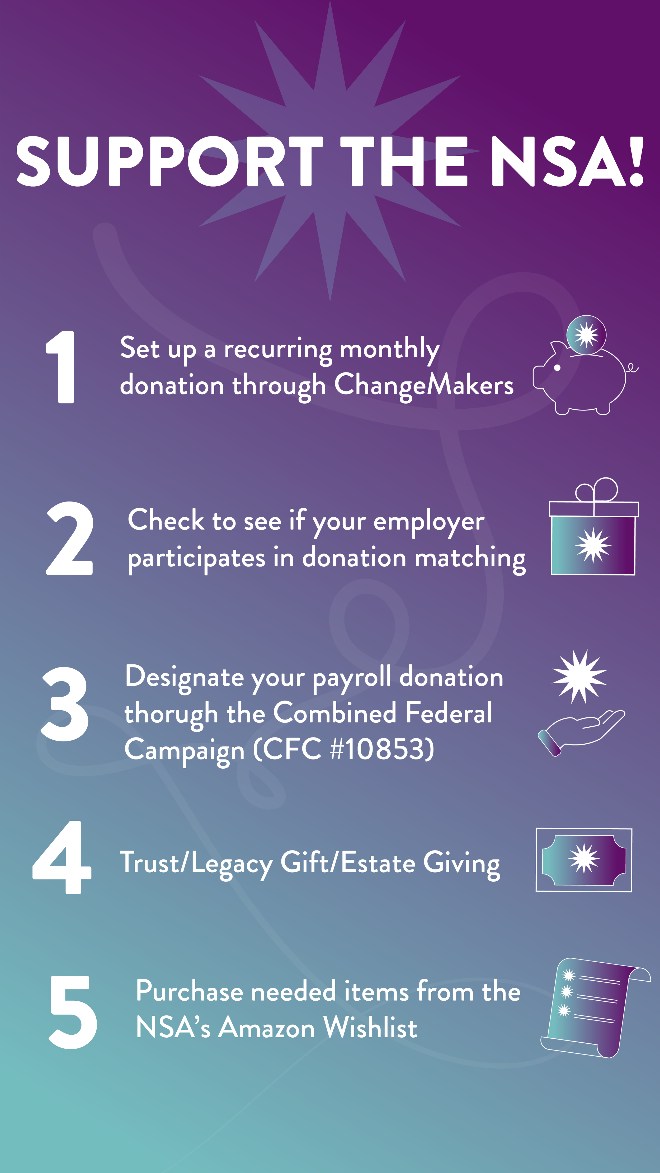
I created Instagram and web graphics for the National Stuttering Association including posters that were used at their annual conference. I sourced local printers and ensured a timely and cost-effective printing process!



The Drama League
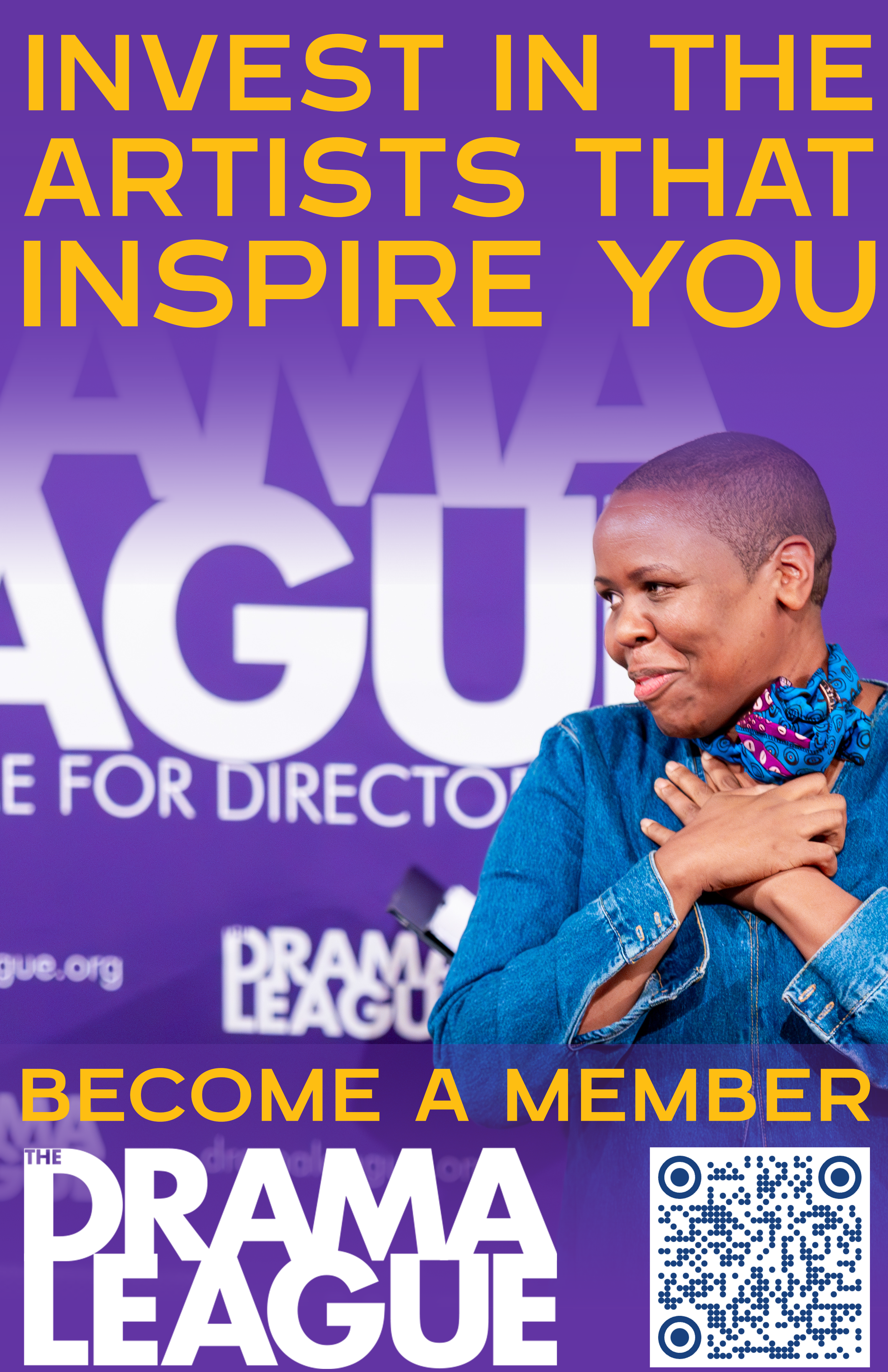
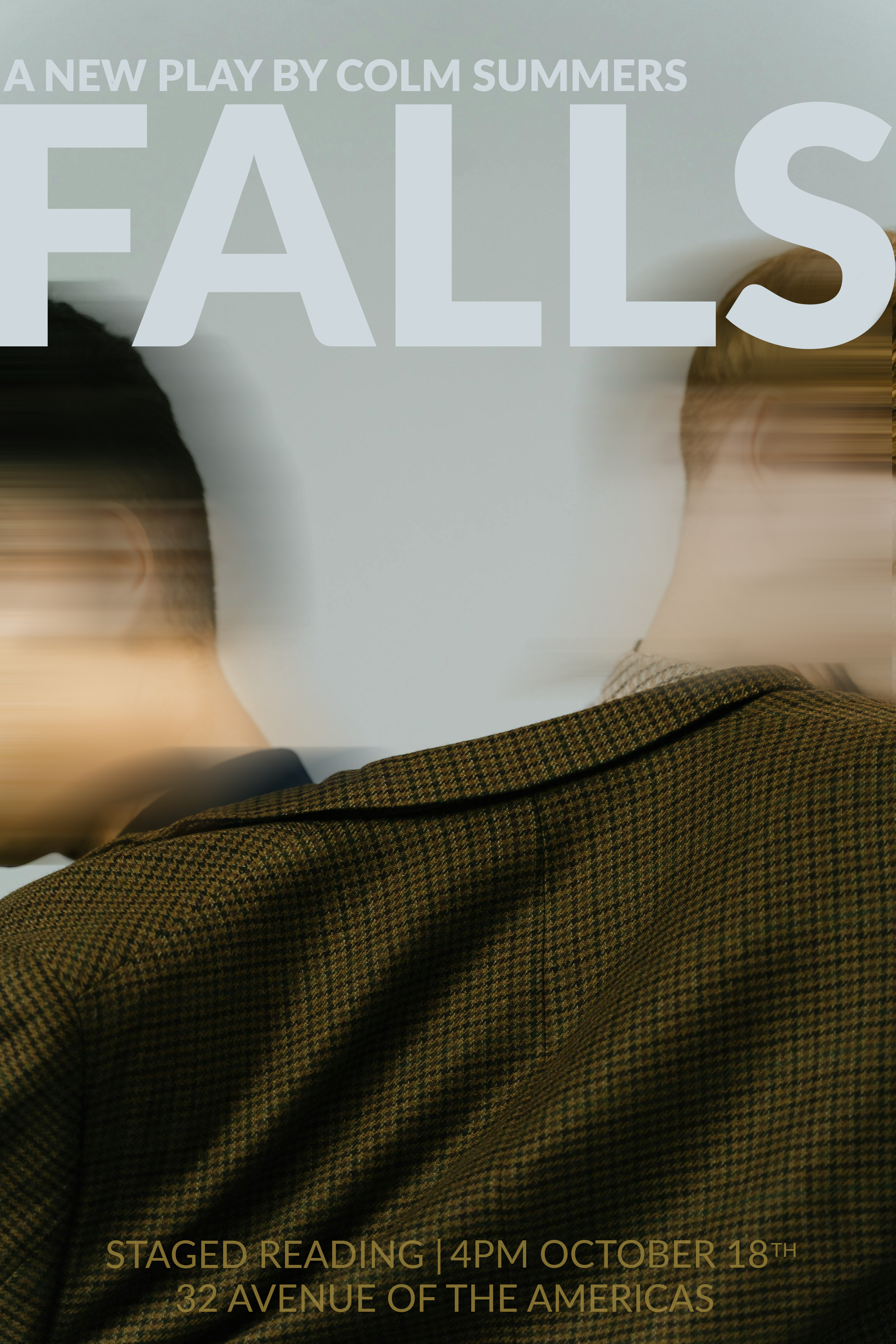
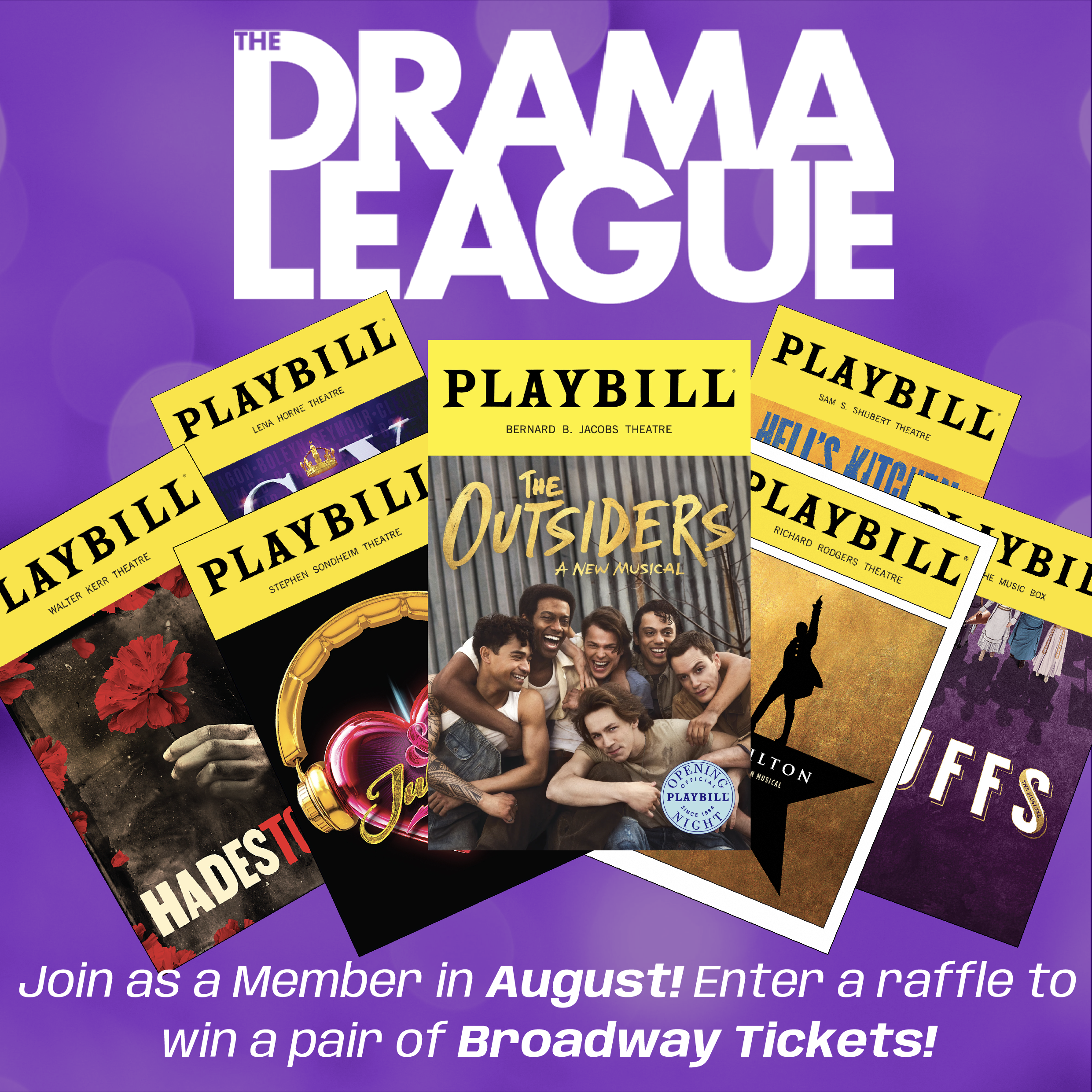
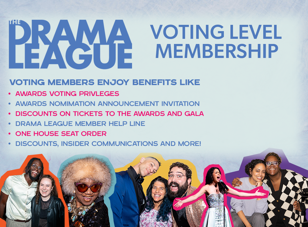
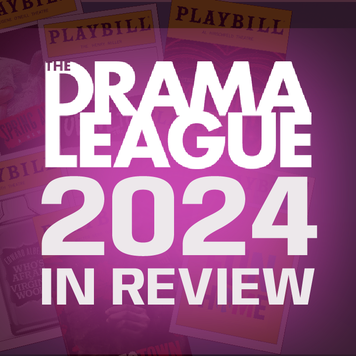
I started my work with the Drama League collaborating with a team of designers to rebrand their membership program. This included a mass-mailing. I sourced printers and mail houses to send our new mailers to over 6000 people. I also work as a communications associate for the Drama League, creating all necessary graphics for their Instagram, Facebook, LinkedIn and mass-emailing.




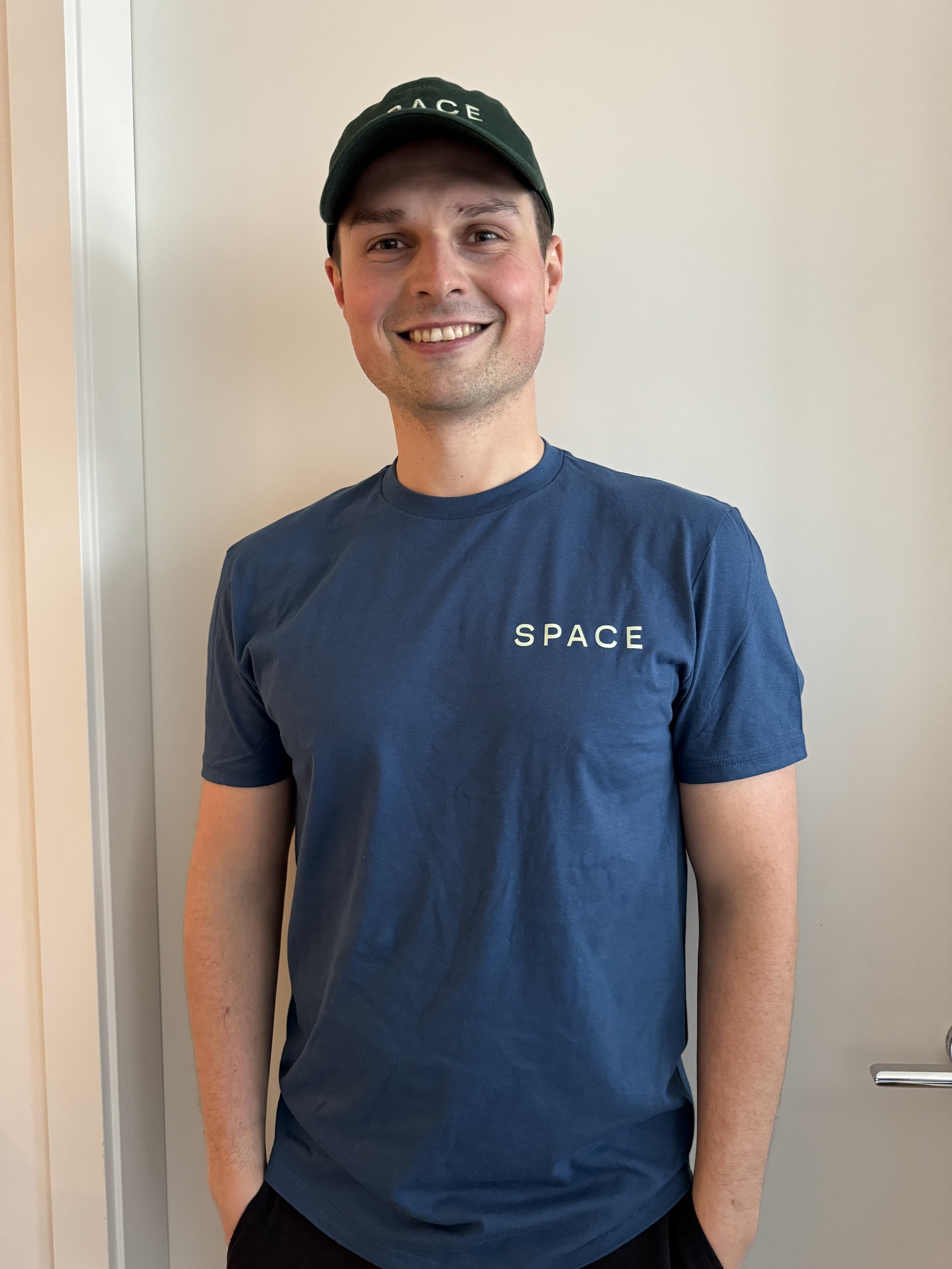
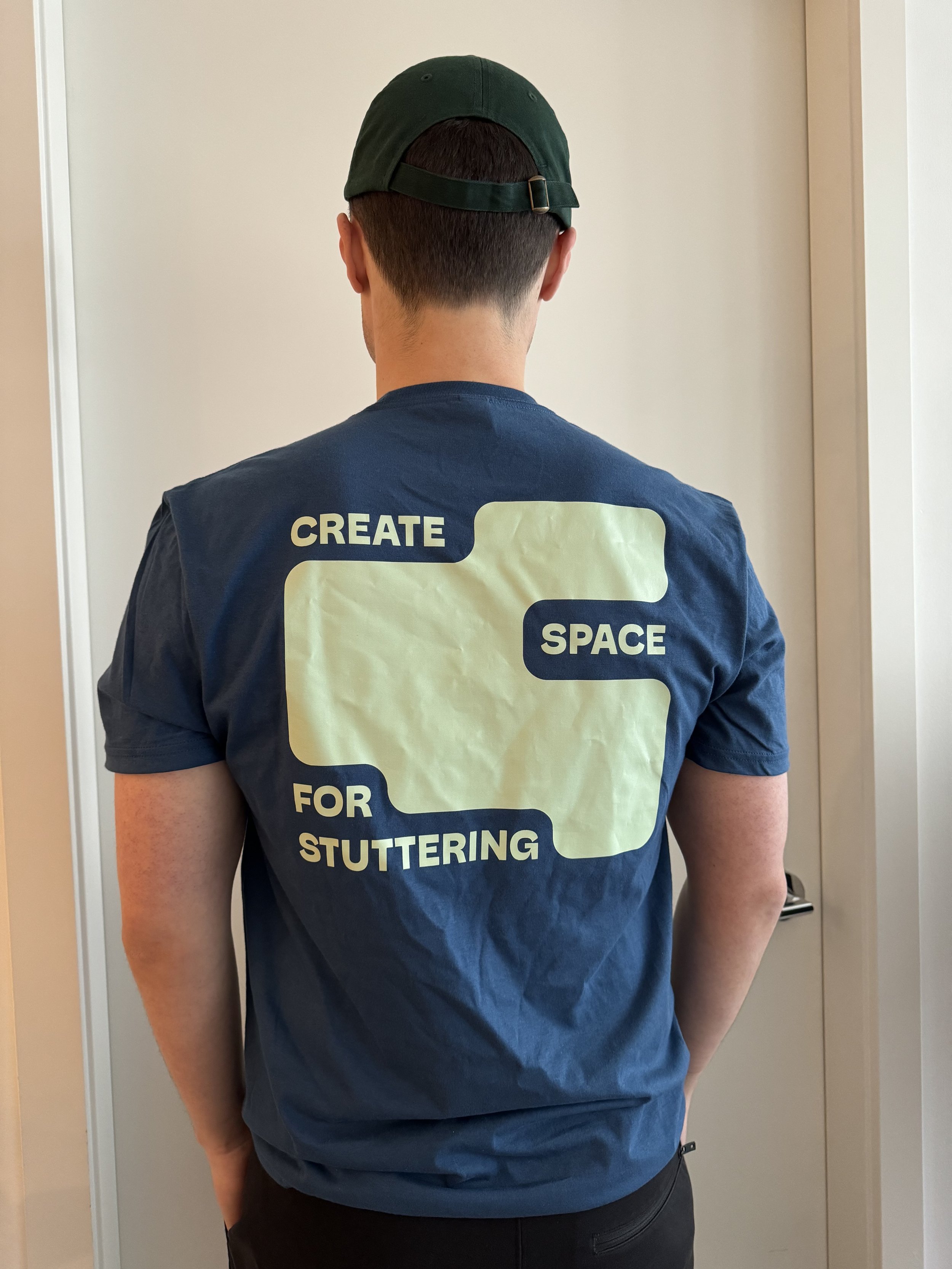
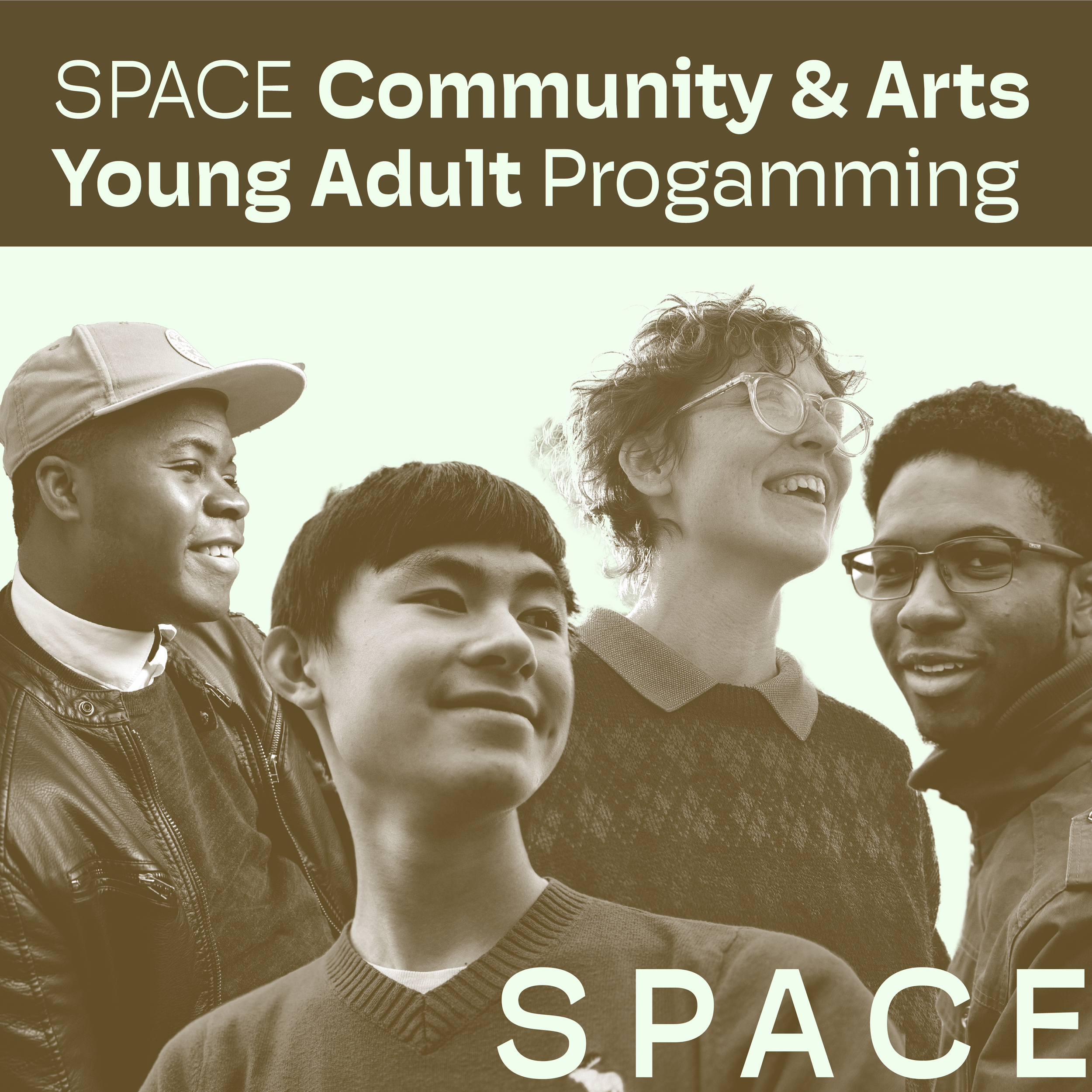
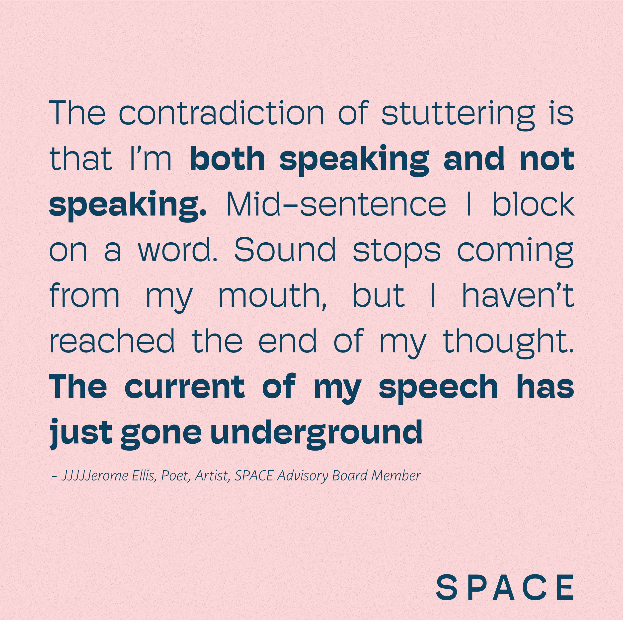
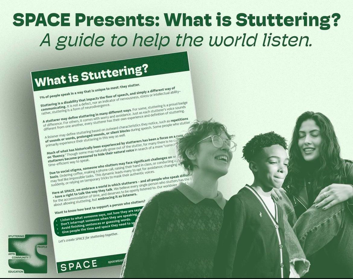
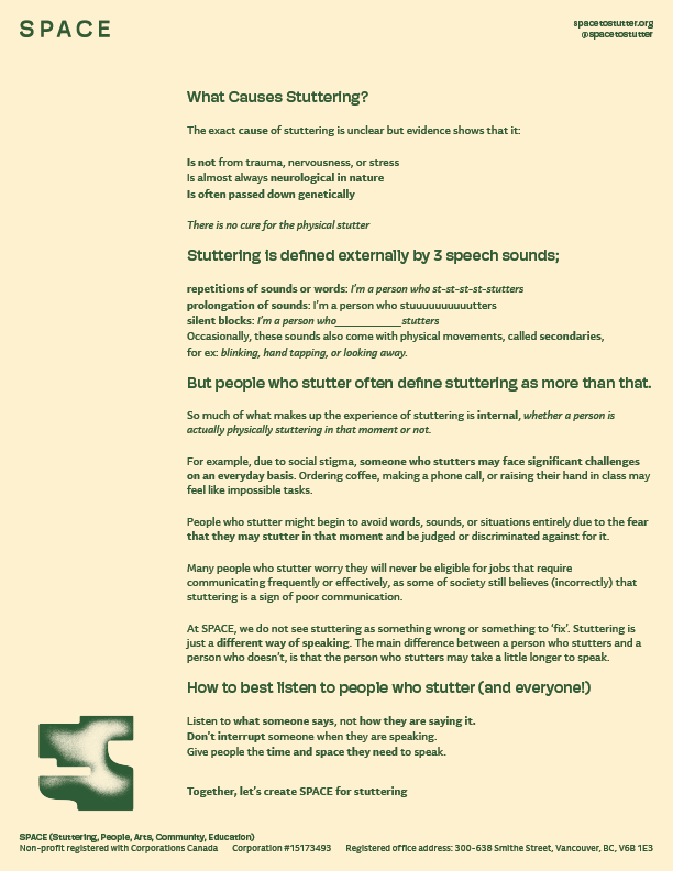
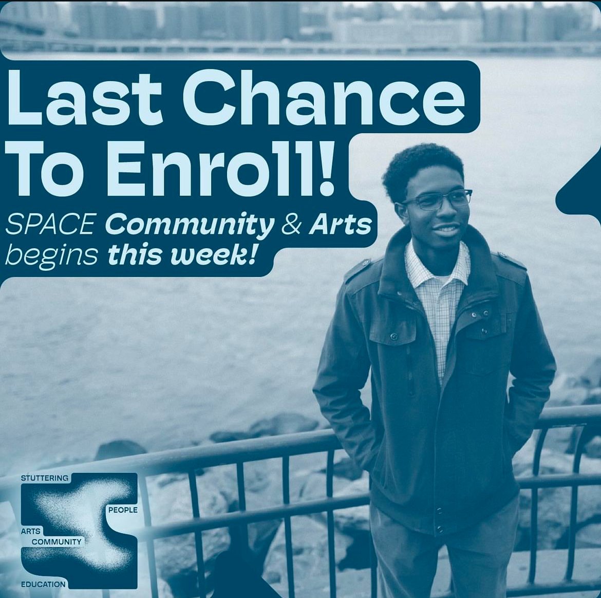
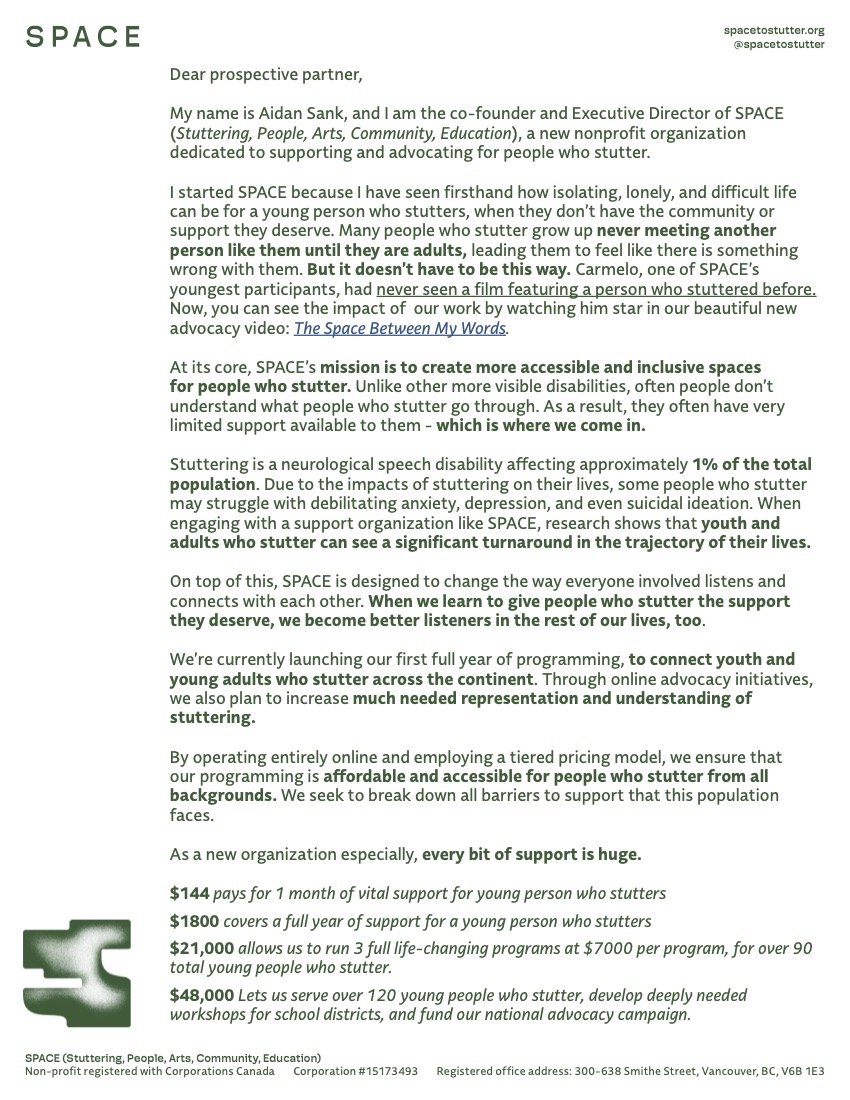
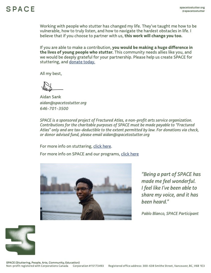
SPACE (Stuttering, People, Arts, Community, Education)
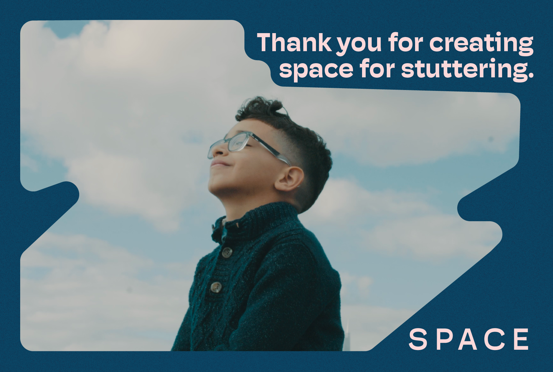
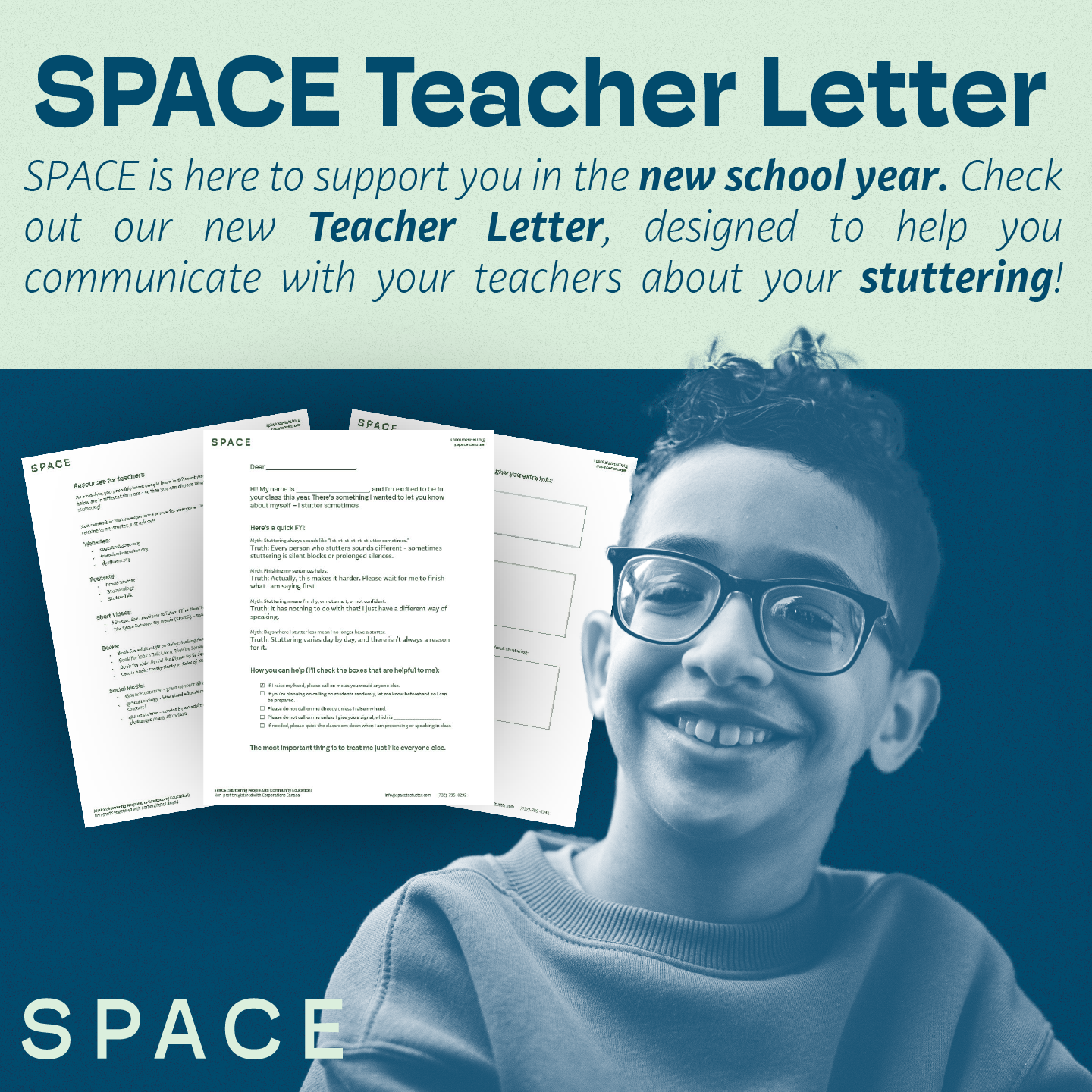
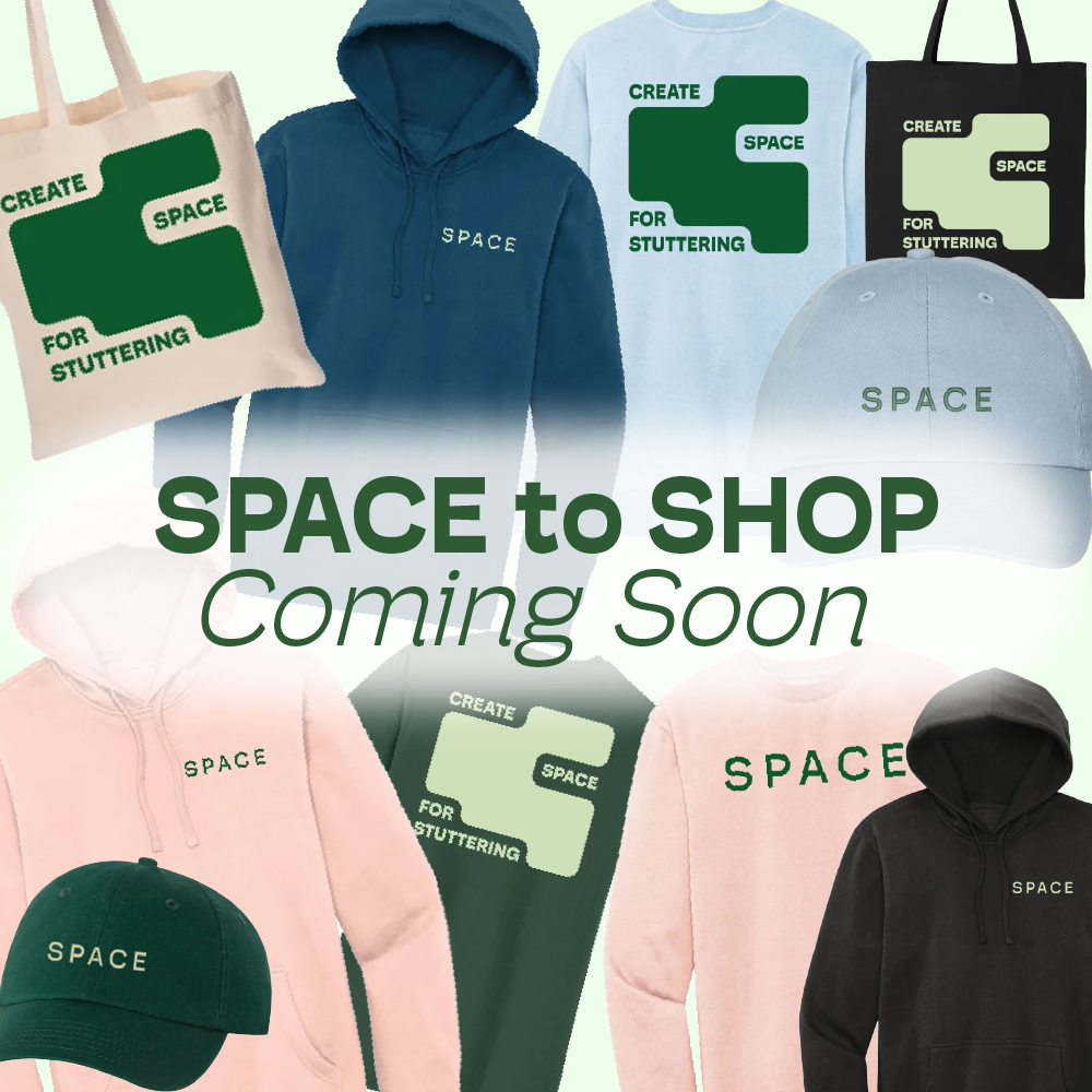
Tasked with growing the SPACE following from the ground up, I created several successful social media campaigns aimed at demonstrating SPACE’s commitment to it’s community. In particular the “What makes your Stuttering Space” campaign doubled our follower count in a few short weeks, while allowing folks who participated to feel special and seen by SPACE.







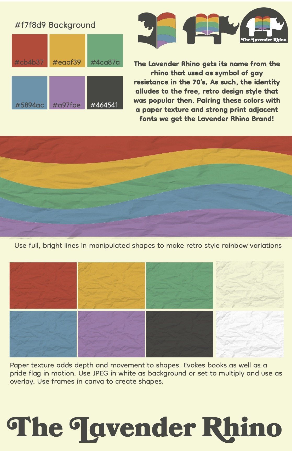
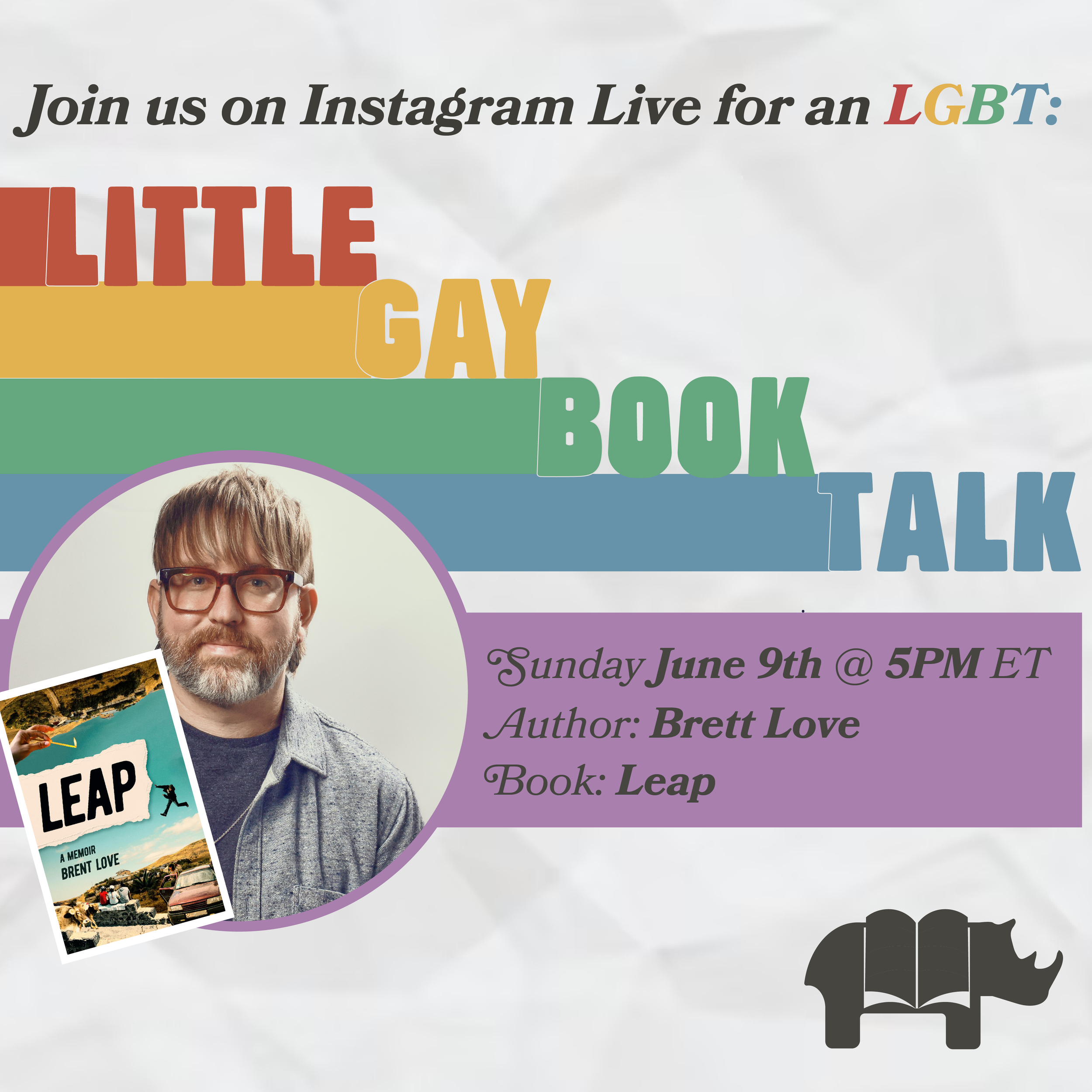
The Lavender Rhino
I created a fun, energetic brand for this bookstore, drawing inspiration from the 70’s when the symbol of the Lavender Rhino was first invented and used as a form of resistance. I created logos, bookmarks and graphic templates for this company.


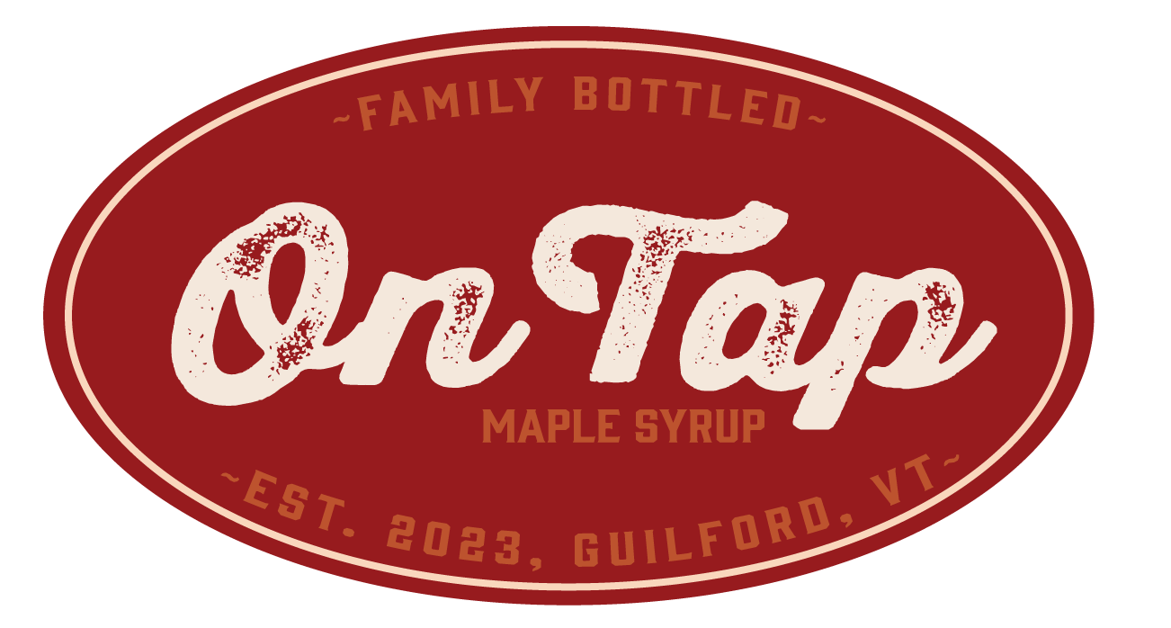
On Tap- Maple Syrup
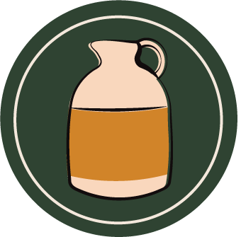
Tasked with creating an inviting brand for a maple syrup company, I used vintage beer labels as inspiration, creating badge-style graphics with a warm color scheme. Playing upon the companies name- I created a “tap” made to look like a bar tap rather than a tree tap. Finally, the name “On Tap” is actually the family’s last name “Patno” backwards. With this in mind I created a tag line: “Family Bottled” to show its home grown nature, and also the message that a bottle of this maple syrup is a bottle of family.


The Friends Convention
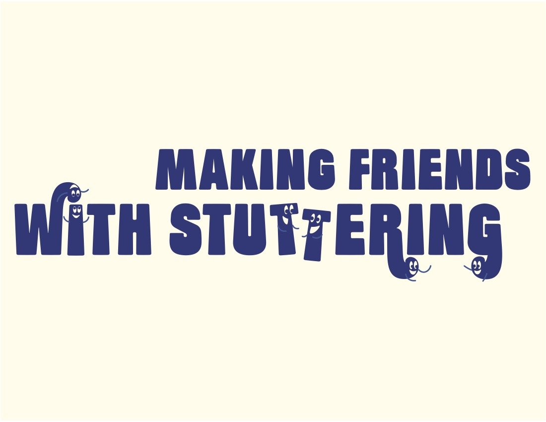
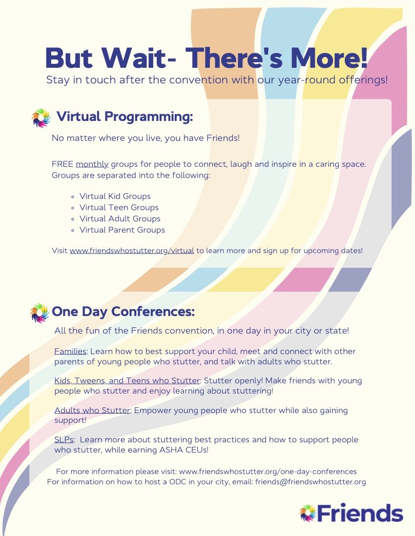
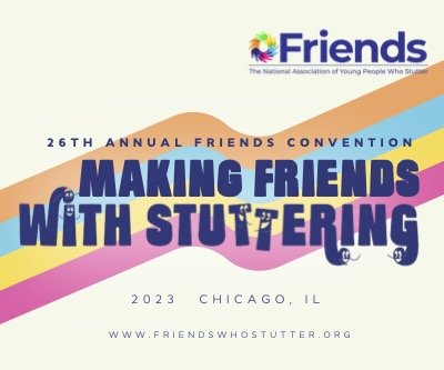
Tasked with making print materials for the annual Friends convention was a unique challenge. Since there were no set brand guidelines for Friends, I used their existing logo and pulled the colors and fonts from there to make a small brand kit to use myself, and for them to use in the future. These nametags, print-outs and stickers added an engaging pop of color to the convention that had previously been missing.


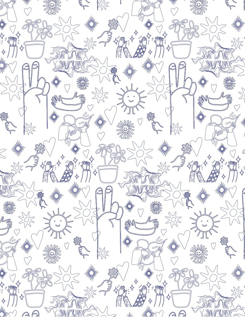
SAY: The Stuttering Association for the Young
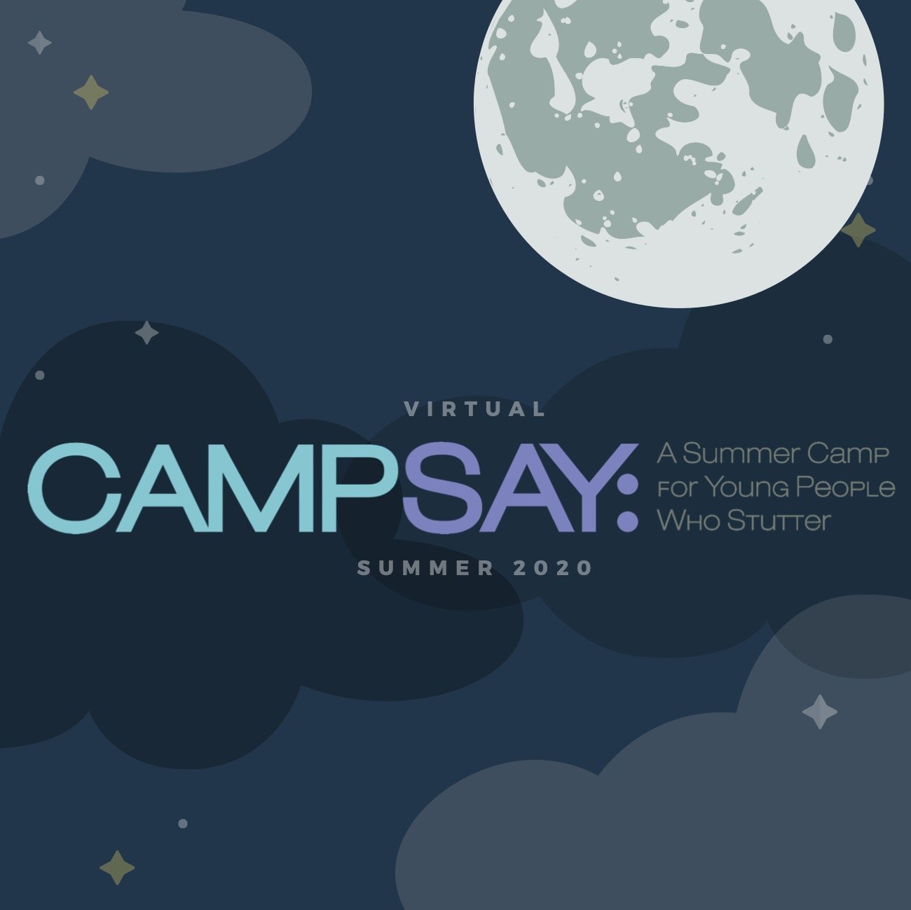
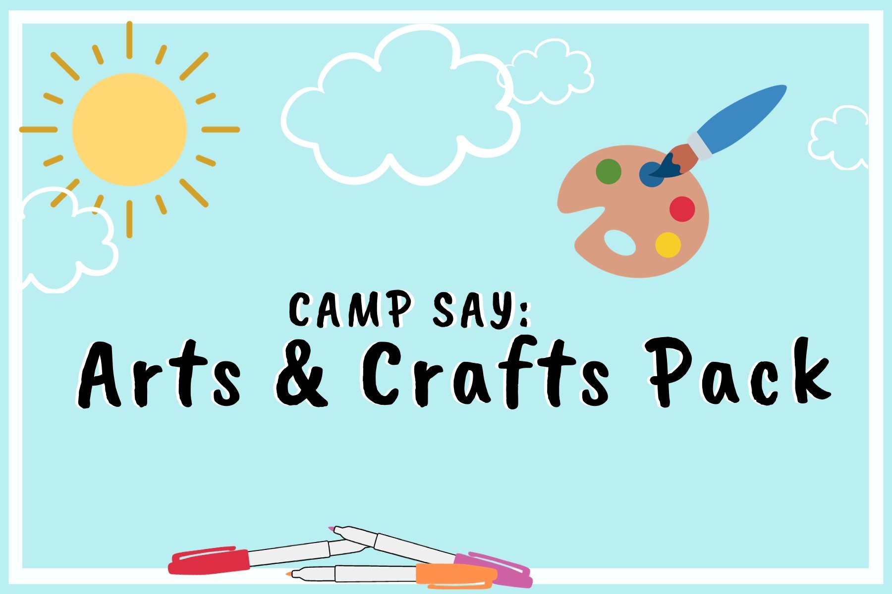
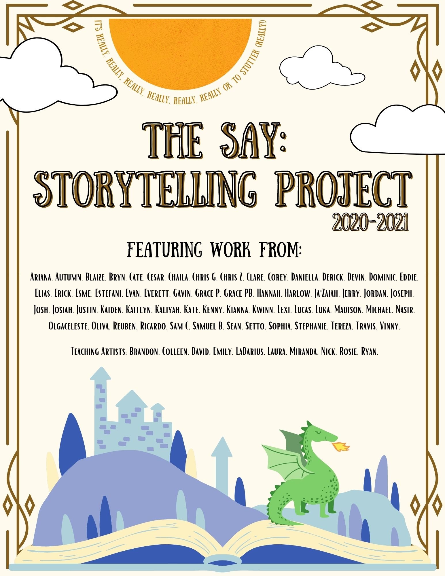
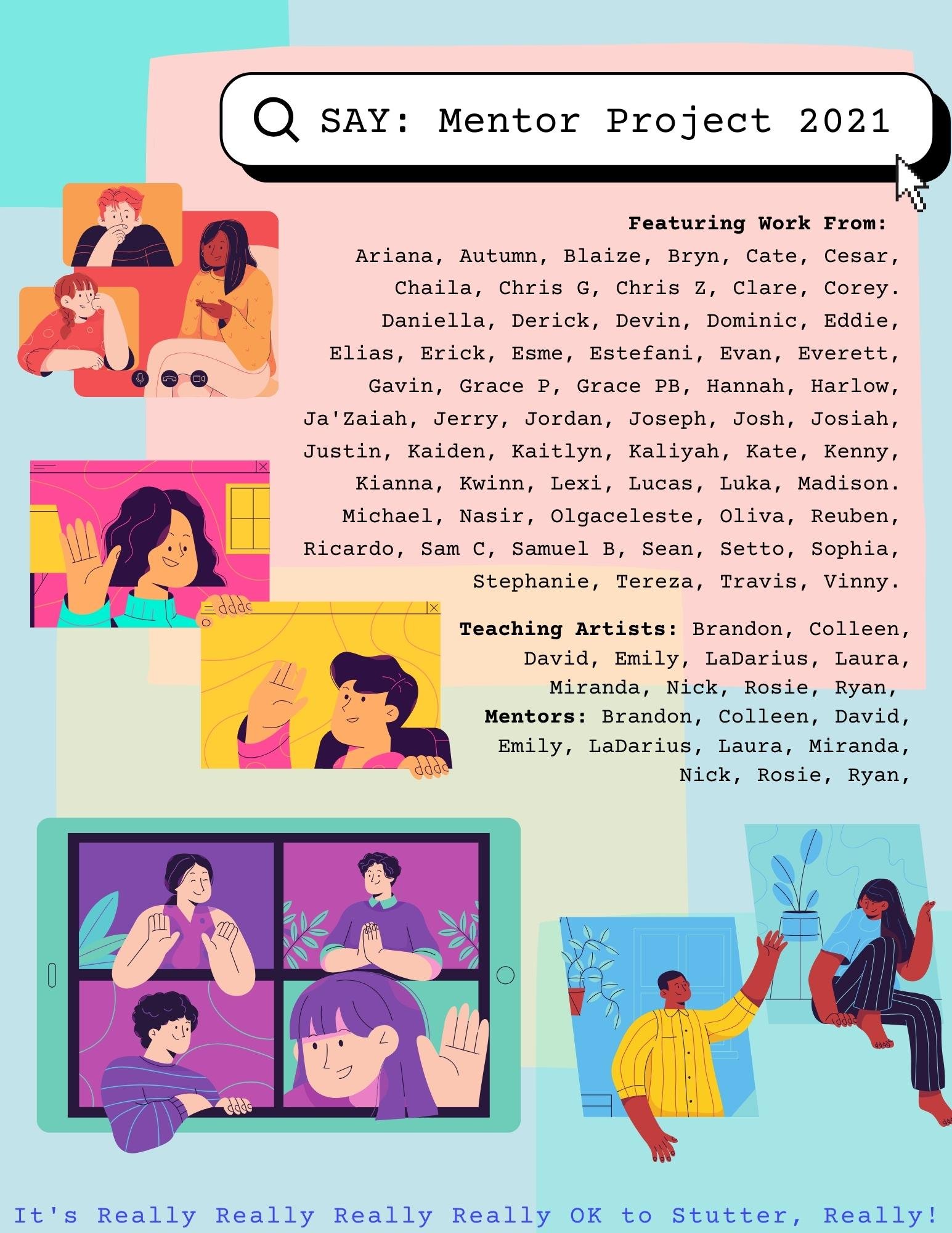
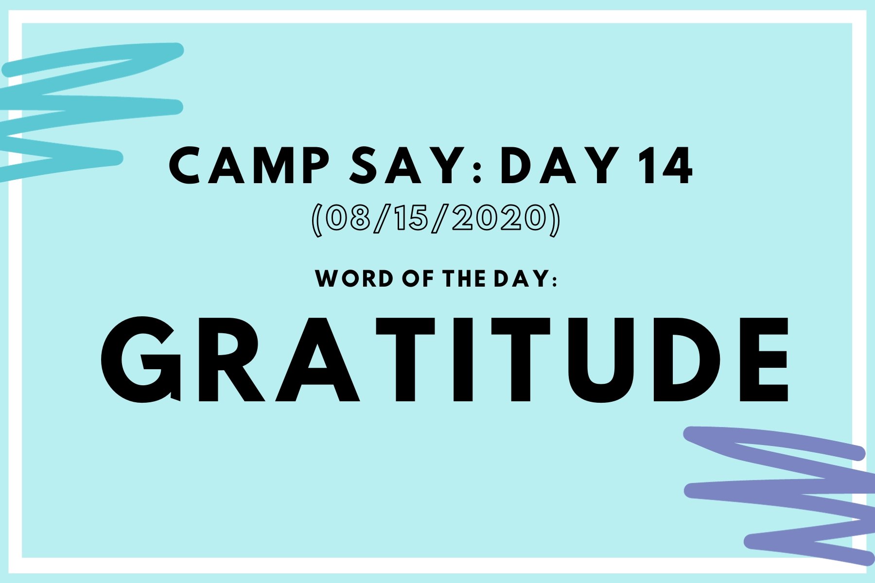
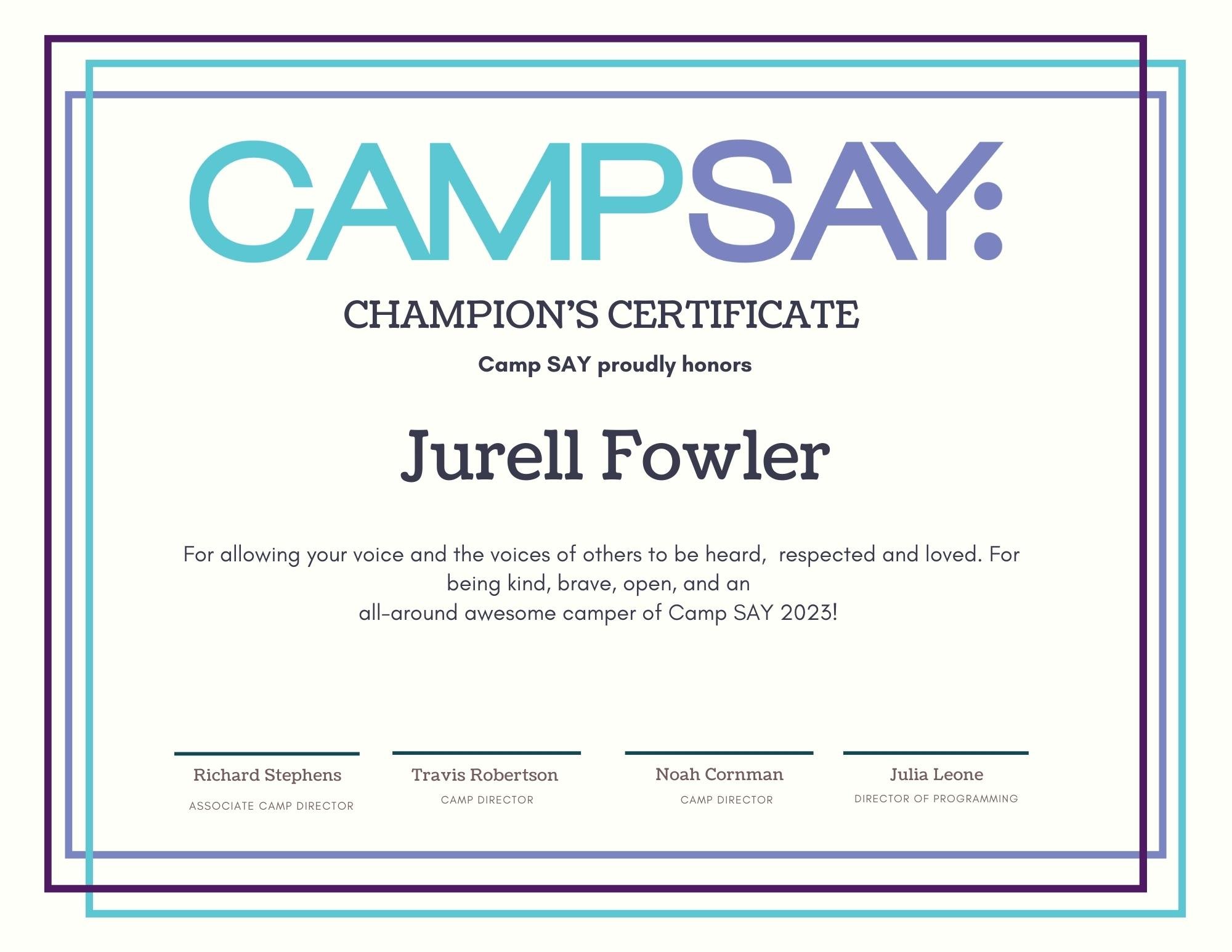
Tasked with creating a variety of materials for SAY over my four-year journey with them, I learned so much about how to connect with young people and large communities. SAY was forced to move to an online platform during the pandemic and remained there for three years. I found it very important to make high-quality printable and virtual materials that helped our community feel very involved in our community even when online. Below you will see a variety of stickers, post cards, Instagram graphics, and show posters that successfully connected with young people, through the screen time and time again.

